
What to consider when designing a beach flag
<p>A clear message, enough contrast and the right print template help a beach flag work even from a distance.</p>
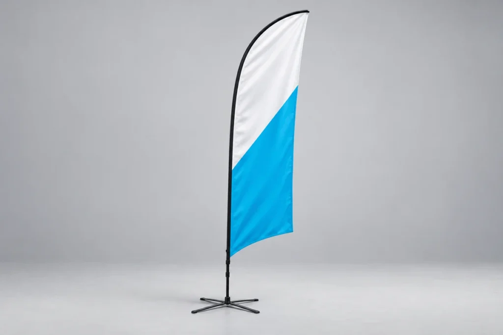
A beach flag often needs to be noticed from far away. Its tall, narrow shape calls for different design thinking than a poster or a web banner. A good starting point is one clear message and a simple visual structure.
Keep the message short
Decide whether the flag’s main job is to show your company name, point people to the entrance or present a product. Trying to do everything at once can make the design too busy. Leave smaller contact details elsewhere if they aren’t easy to read on the flag.
Use contrast deliberately
Check that text and logo stand out from the background. Small details and thin lines can disappear at a distance. Look at the design at a reduced size too: if the main message isn’t clear straight away, simplify it.
Allow for the flag’s shape and edges
Start from the print template of the specific flag model. Keep important elements inside the visible area and away from the seam allowance and pole pocket. Don’t stretch the logo just to fill the whole area. Change the layout instead, or use a suitable version of the logo.
Confirm the print and kit you need
Before finishing the design, ask how the print looks from the other side of the flag and whether you need a single- or double-sided solution. Also confirm the pole and base for the location. Indoors, hard outdoor surfaces and soft ground may need different bases.
In your enquiry, add the quantity, where it will be used, the shape you prefer and any existing design. The choice of beach flags and flags can then weigh both visibility and the right construction.
Related products
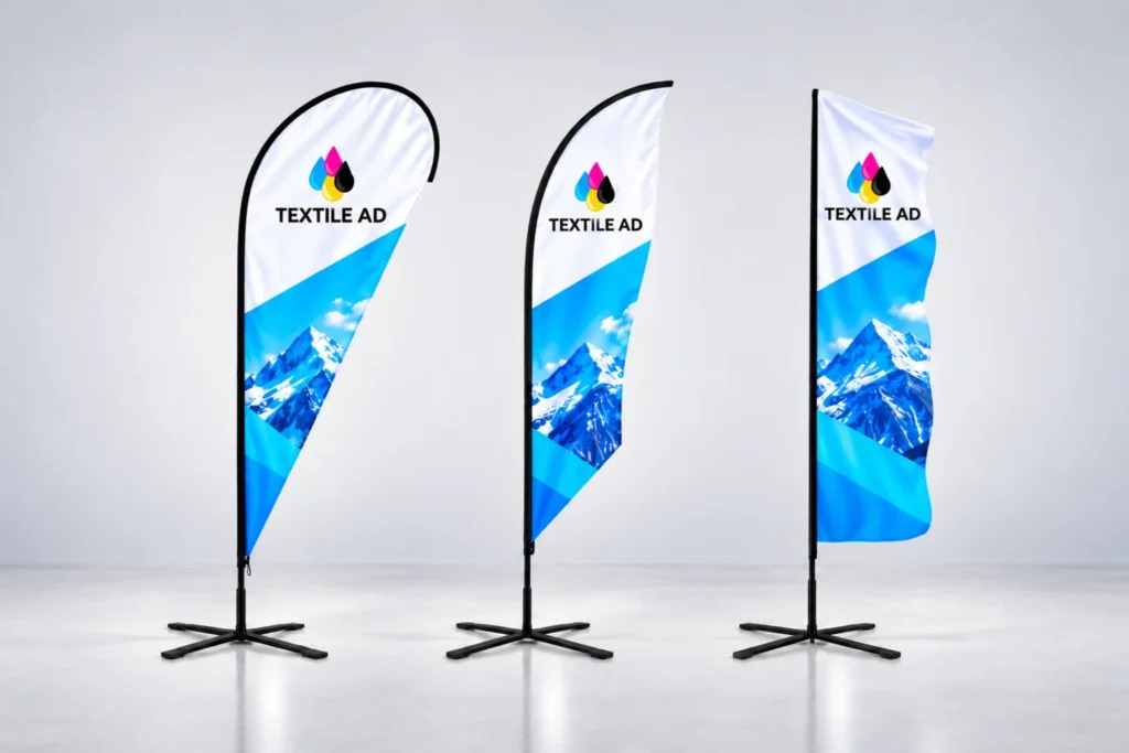 Beach flag Eco
Affordable beach flag for events and shop fronts. Flag, pole and bag.
Price on request
Delivery time 3–5 working days
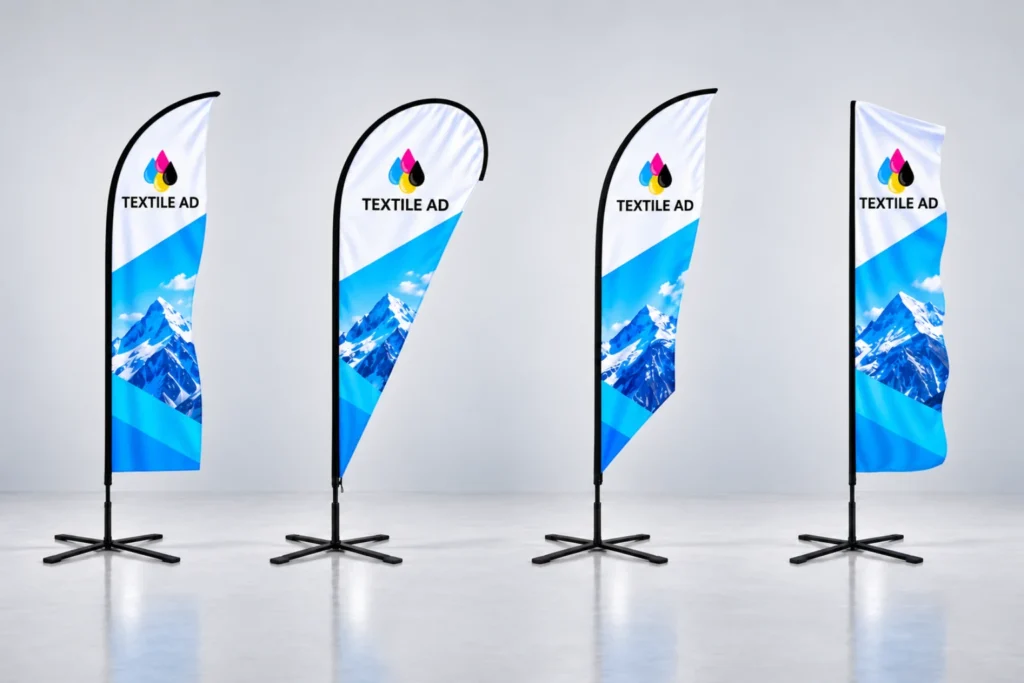 Beach flag Pro
Portable outdoor advertising for events, shop fronts and competitions. Choose the shape, size and base.
Price on request
Delivery time 3–5 working days
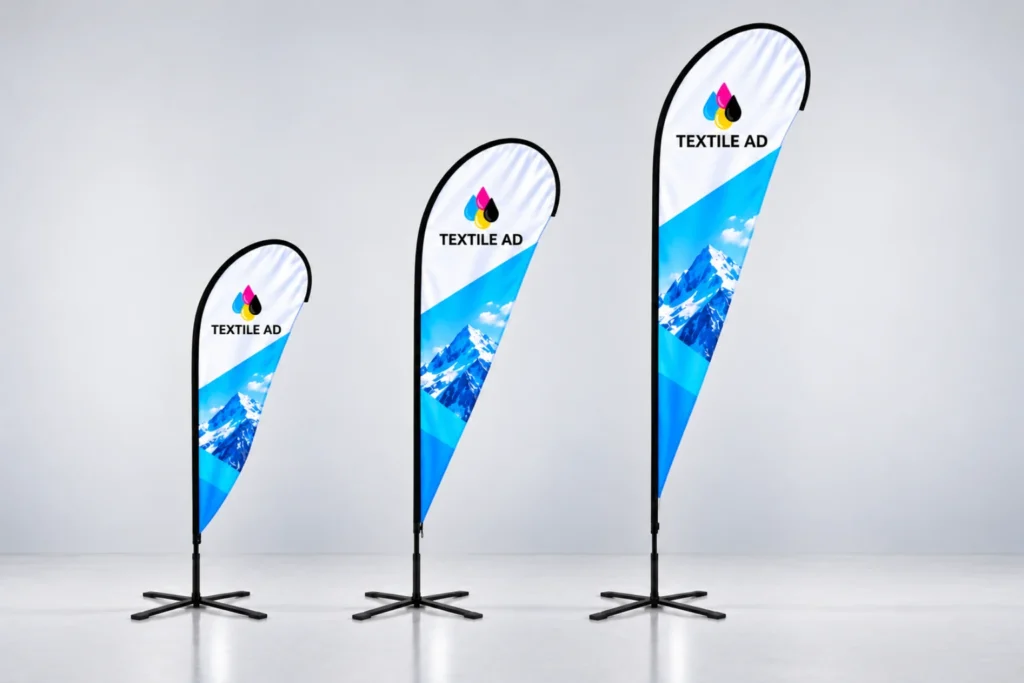 Beach flag Premium
Beach flag with a stronger pole that holds up on a windy day.
Price on request
Delivery time 3–5 working days
Read next
 9 October 2026
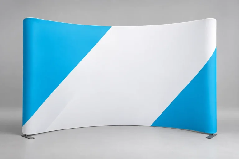
How to choose the right photo wall for an exhibition
When choosing a photo wall, the location, visibility, set-up and design matter most. Here's where to start.
 9 October 2026
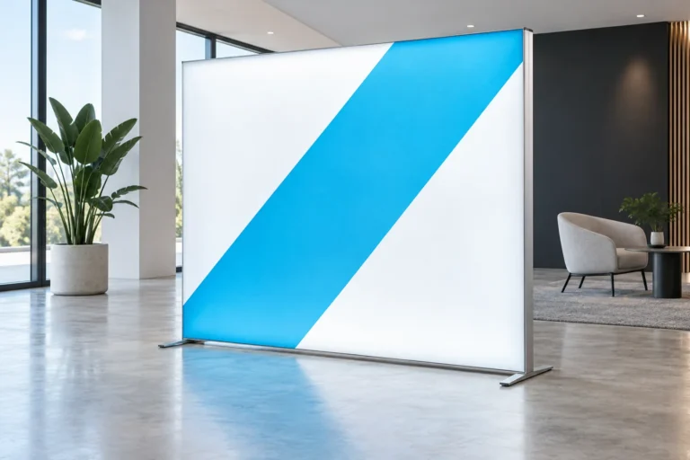
Lightboxes in a space: options and uses
A fabric lightbox can emphasise a message, shape an exhibition stand or bring your company look into a showroom. The choice starts with the…